MUNCHY TIME
RETURN

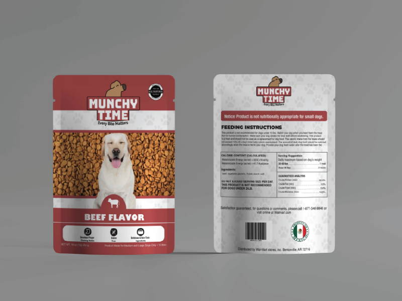
Munchy Time was a packaging design assignment, requiring us to make a logo and package design for dog food. For the logo, I modified the font Arial Black and rounded out the edges to make Munchy Time stand out, and added a sniffing dog on top to accompany the text. The majority of the information on the packaging was provided from the professor while I had to create the packaging design myself. I did this by organizing everything in a vertical and almost centered design, allowing users to easily navigate it and easily find information in a standout place on the packaging.
